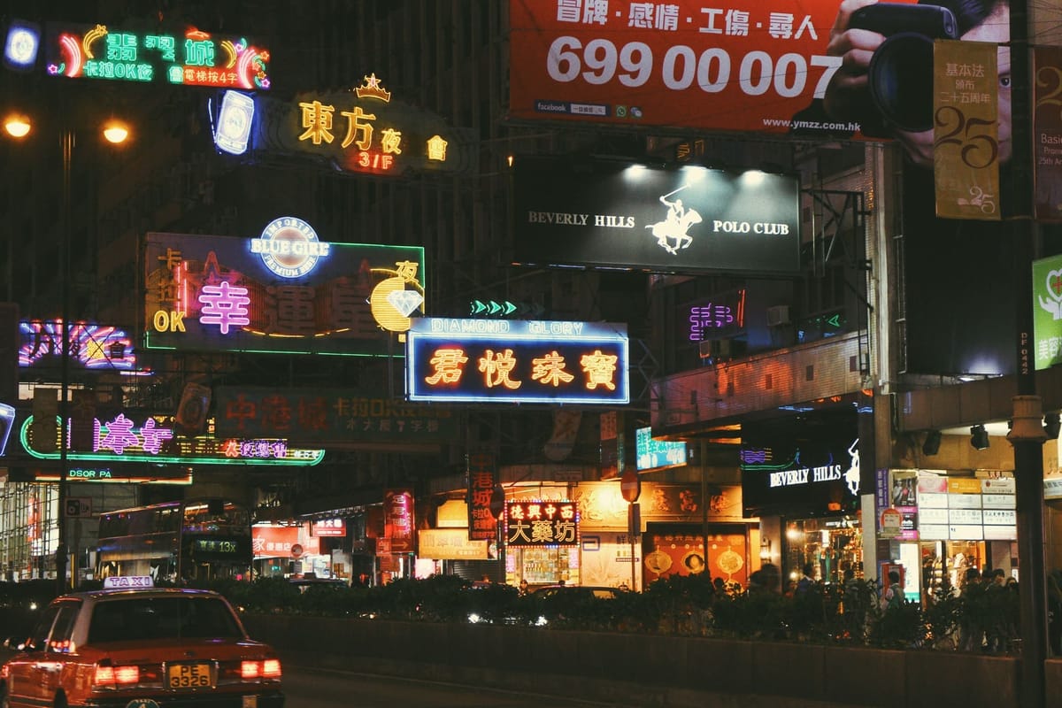
If you ask anyone about what stands out in Hong Kong's city scene, they will mention the striking look of the cyberpunk tall skyscrapers and cinematic ambience of the many shop signs in various sizes that are seen alongside plain concrete buildings. The mix of images and words on shop signs in Hong Kong reflects different cultures. This combination creates a unique atmosphere and shows how local society has grown and adapted over time. Different areas have their own main types of jobs. Shop signs of similar businesses often appear among buildings. These signs help create a sense of place and serve as a way to find your way around.
The loud colorful chaos was born out of necessity – because of the limited land supply, narrow streets, post-war homogeneous architecture, shop owners in Hong Kong struggled to get their business noticed. In the past, there were not strict rules for shop signs. This allowed business owners to make unique signs that helped promote their stores and inform people walking by.
Yet the shop signs are fading at an unprecedented rate. With rapid urban renewal and gentrification, e.g. renewal of Lee Tung Street (a street selling printed wedding cards), gentrified shopping malls built in Mong Kok and Tsim Sha Tsui (think high-end shopping malls along Victoria Harbour), and government regulations, old buildings are pulled down, so are shop signs. For instance in 2017, more than 1300 shop signs were taken down. The new landmark buildings act as signs that help people find their way. This makes traditional shop signs less important. What once was the defining feature of Hong Kong’s street view now fades.
This article looks at how Hong Kong shop signs become one of the local cultural representations. It examines the visual, verbal, and physical aspects of these signs. The goal is to highlight their role and explore future possibilities for these unique urban features.
Learn the languages – how shop signs convey messages
Visual conventions and medium of shop signs
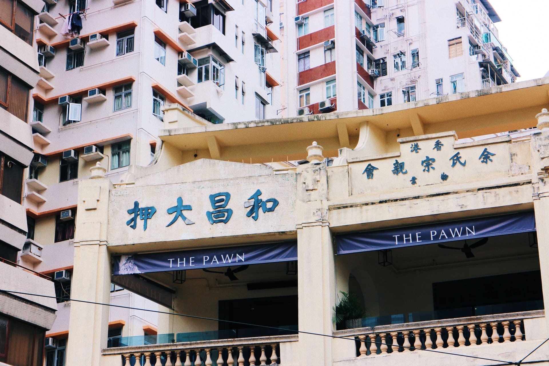
Shop signs can be found in many shapes and sizes. However, some have unique styles and materials that make them easy to identify as specific types of businesses. These are pawn shops, massage parlours, exchange shops, medical business, and hourly hotels. Their symbols and methods are developed naturally as their business changes.
Pawn shops
You can easily spot a pawn shop by its sign. It usually has a classic symbol featuring a stylized bat and a coin. This sign may be found on a canvas, plastic lightbox, or in neon tubes. The Chinese pronunciation of ‘bat’ is the same as that of ‘happiness’, making it represent auspiciousness.
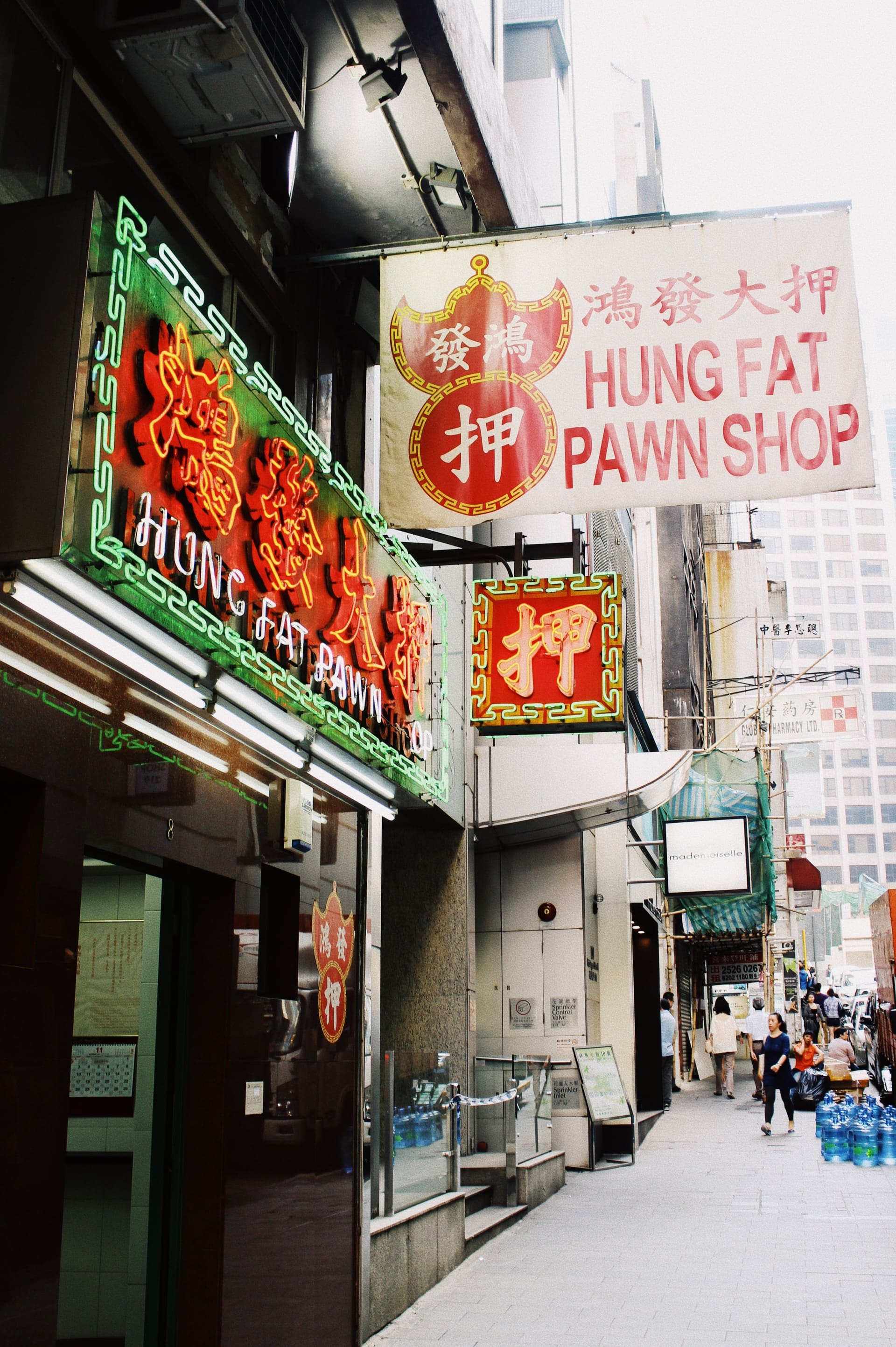
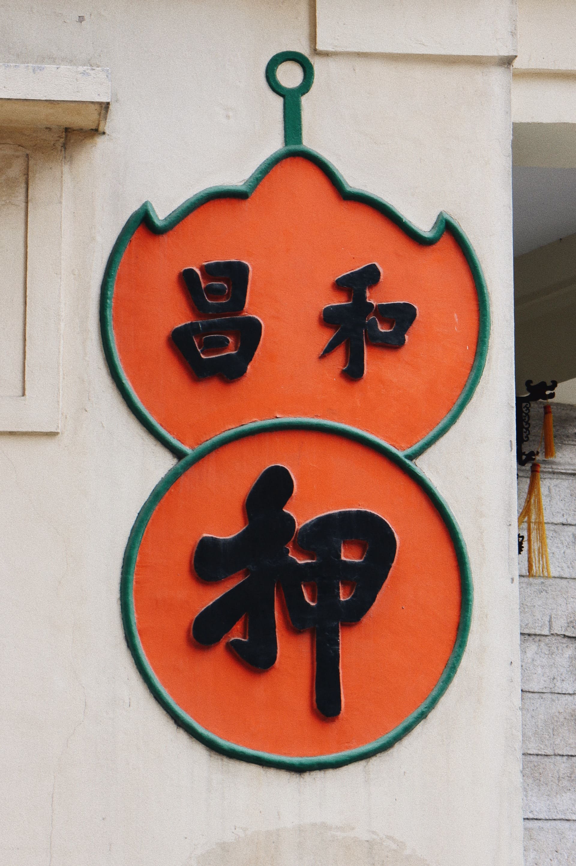

The stylized bat and coin symbol of pawn shops in different media, form neon, canvas, to wall painting
Medical business
Once being a humble white lightbox, pharmacy signs are now made of colorful LED lights with registered trademark (the symbol of letter ‘P’ combined with letter ‘X’ placed in a white square of a red cross). After the Individual Visit Scheme was introduced in 2003 to let mainlanders visit Hong Kong and Macau freely, tourism in Hong Kong gained another source of income. Tourists buy duty-free baby formula, medicine, and other items. This makes pharmacies popular with them. As a result, these shops started using bright LED signs to attract customers.
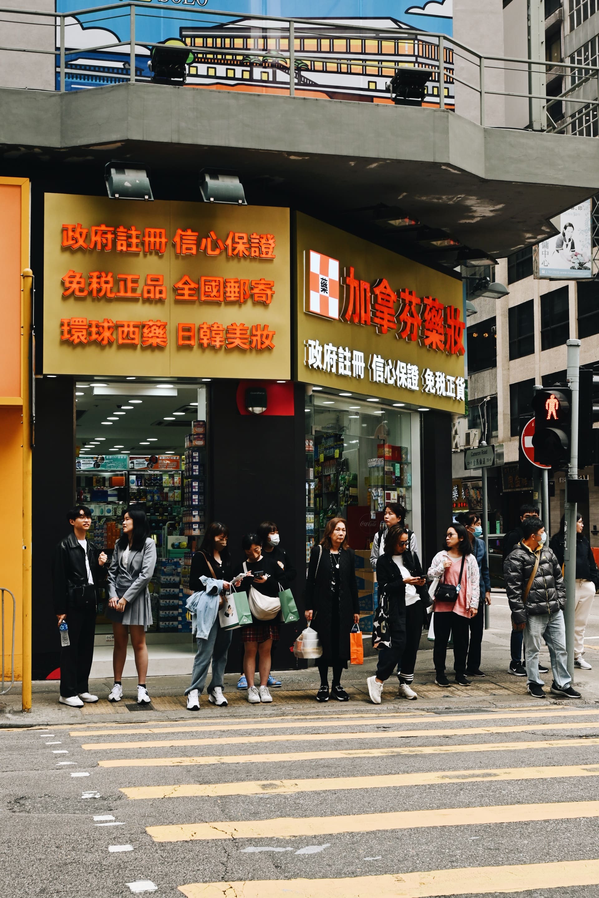
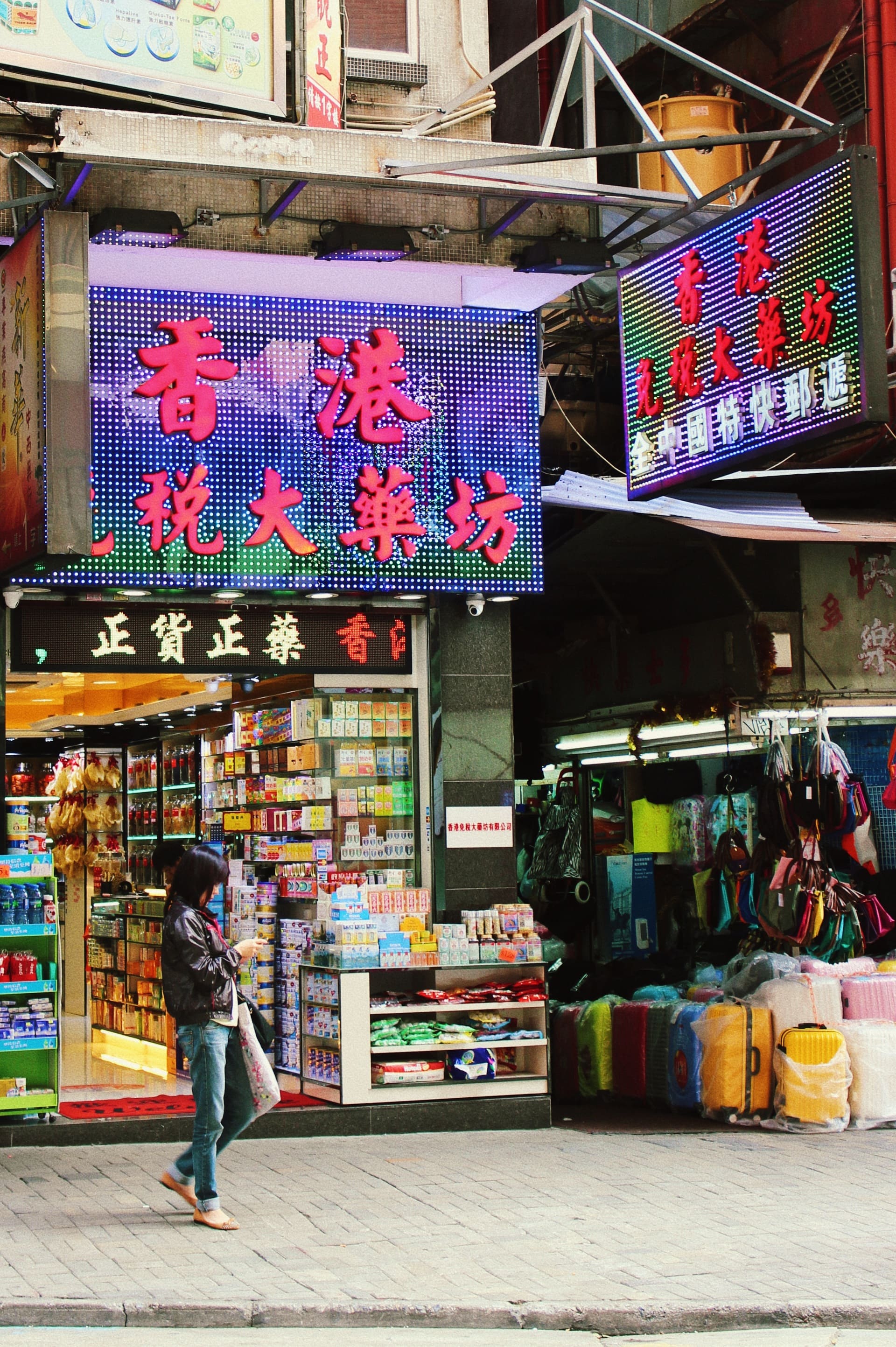
LED lightboxes of duty-free pharmacies, with some stating what it offers, and that it’s government registered
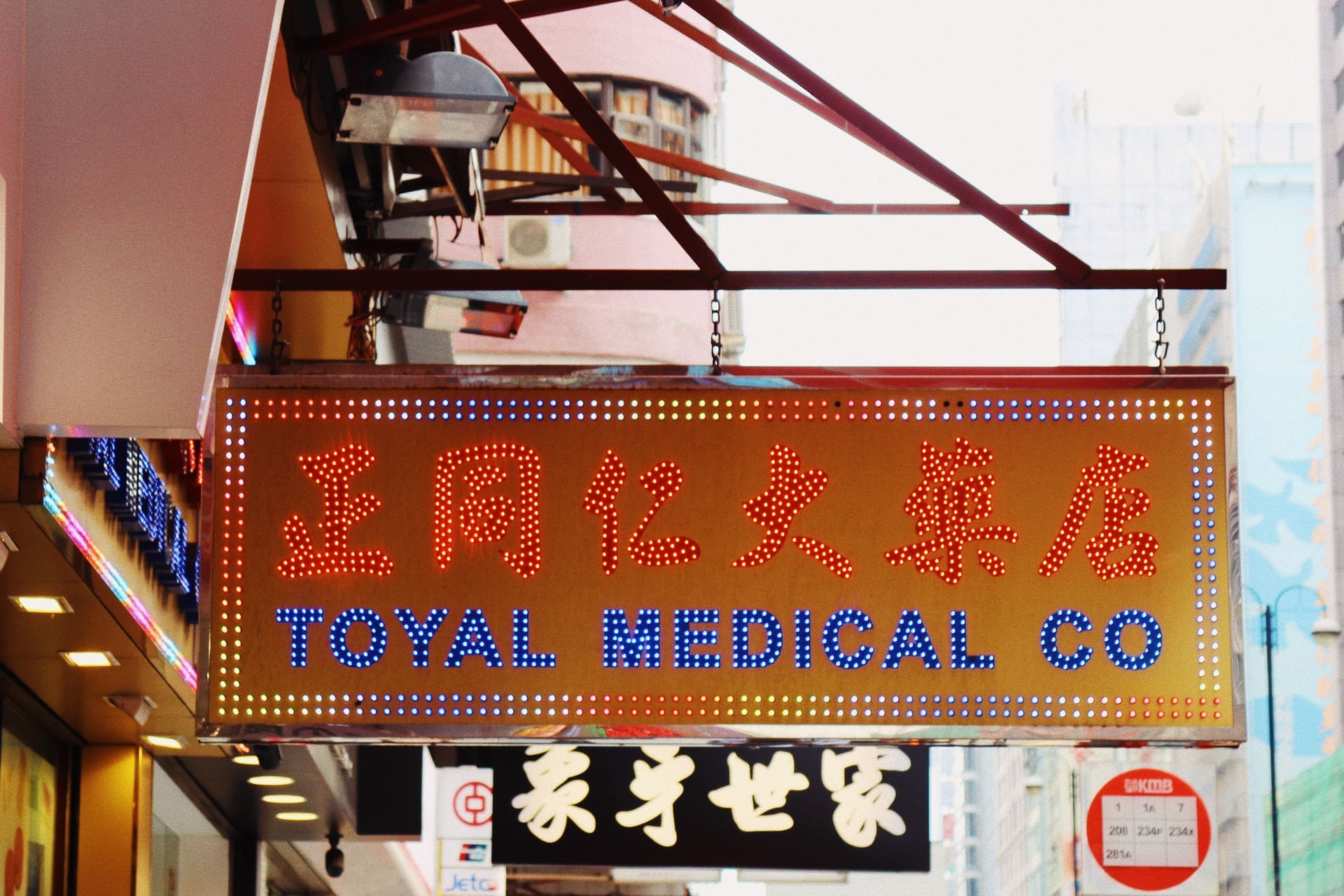
As for small clinics, they present things in a much more subtle manner, using a humble lightbox and clean text layout because of restrictions on related signage.
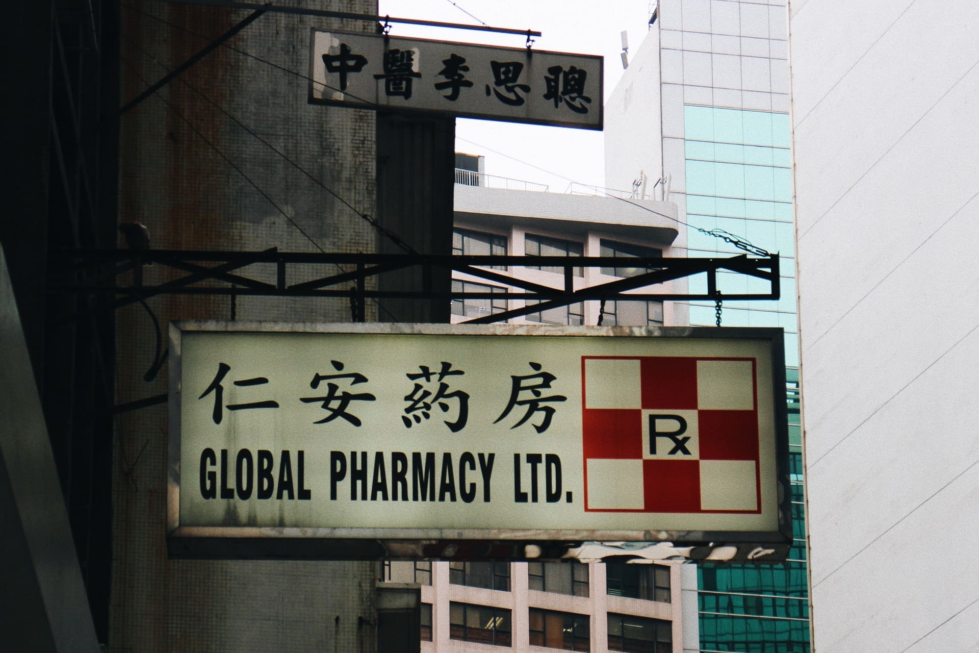
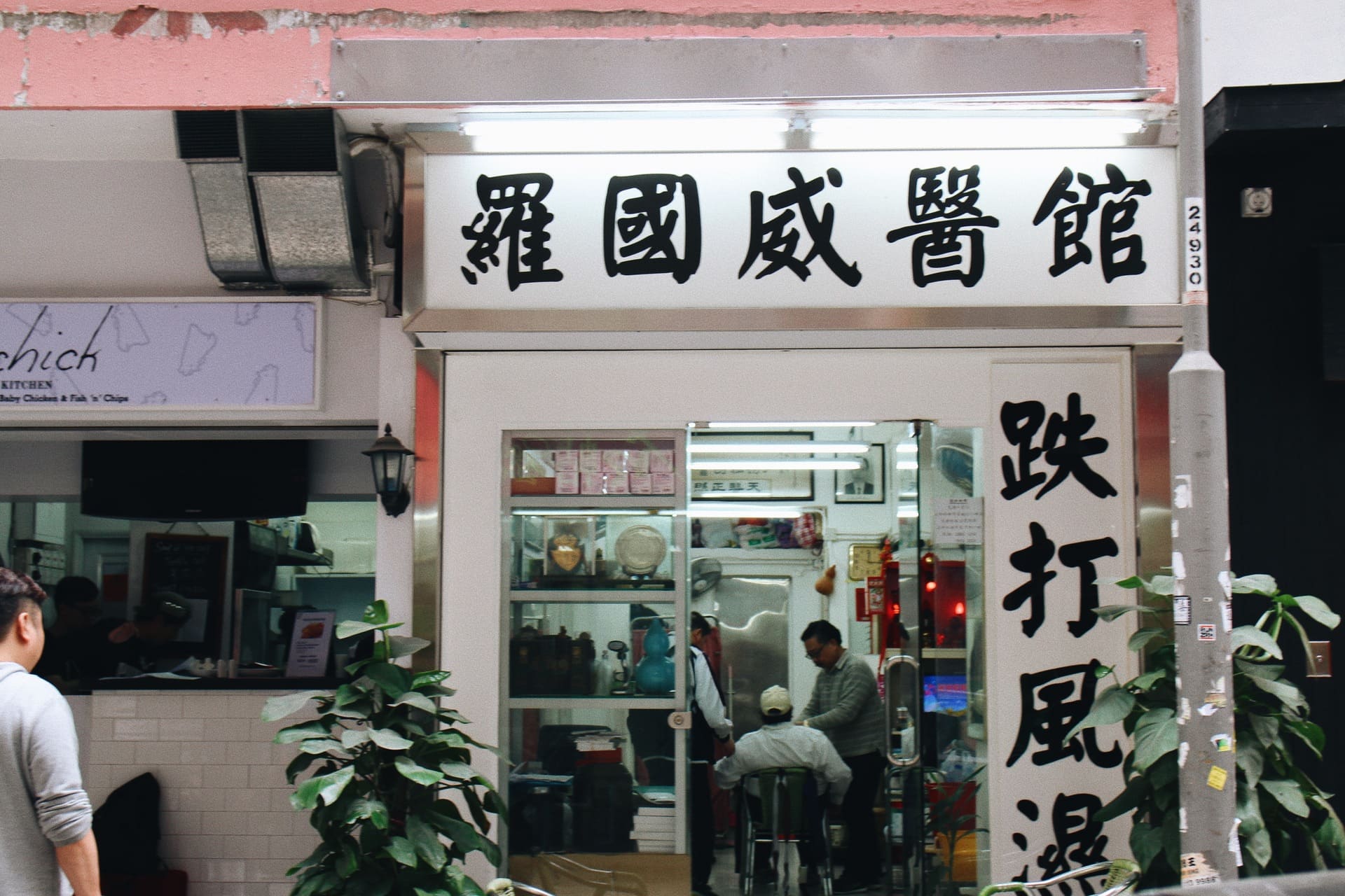
Old traditional pharmacy shop signs and Chinese clinic name presented in a simple lightbox
Exchange shops
Small exchange shops are frequently found in tourist areas. Most of the shops show the existence by using yellow in the stall and LED lights. Whether in daylight or in the dark, people can always spot them. With the types of currency available shown, they can have a clearer idea which to go.
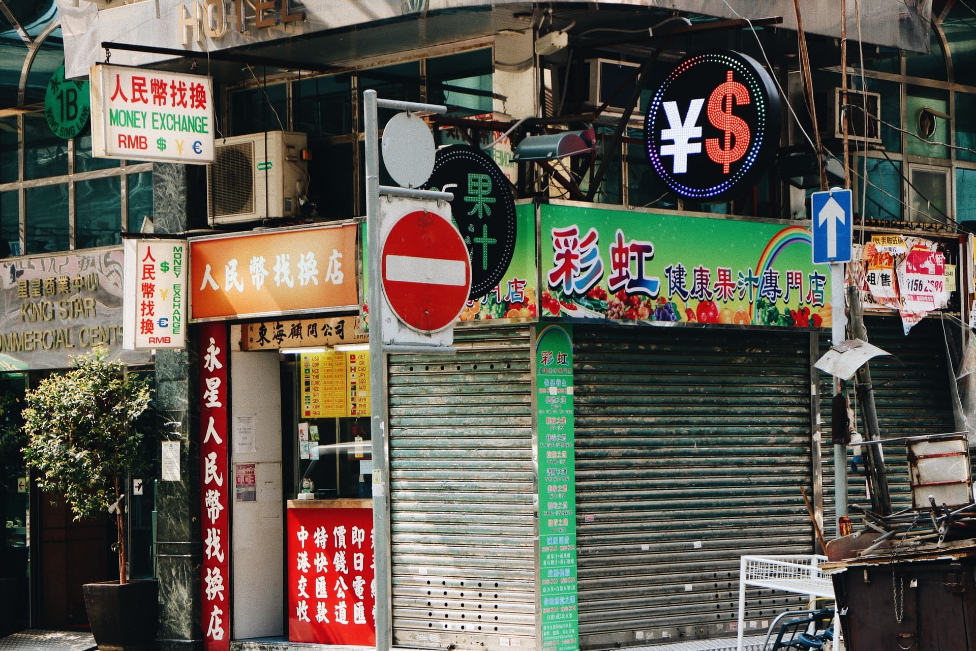
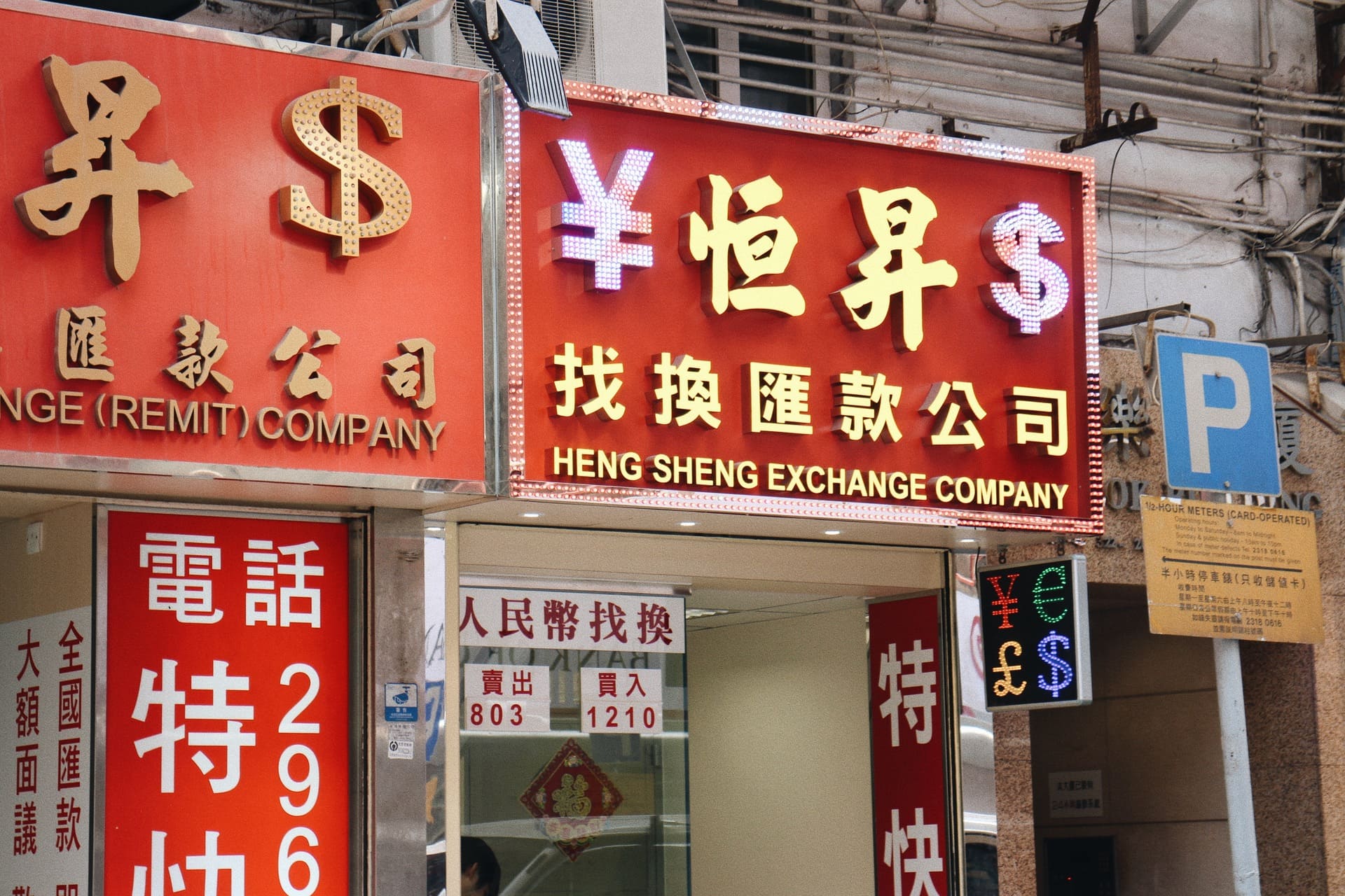
Signs of exchange shops, featuring symbols of different currencies
Hourly hotels
Though named as hotels, they are different from the usual ones. Hourly hotels have their signage in neon of warm colors and lilac, which enable people to see them far away in the dark. Often seen in older buildings, they provide affordable places to stay for certain needs. Some hotels are labeled ‘just offering rooms’, which make their nature more obvious. The neon pink still glows when night falls, hinting a nostalgic sense of lurking desire.
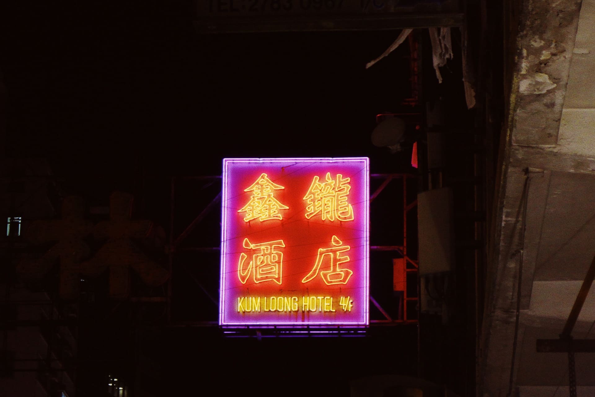
Neon signs of hourly hotels
Massage parlours
Body massages are popular in Hong Kong. While some run them in chain stores, a lot are operated on a small scale. Shops providing affordable massage are usually located on upper floors of old buildings. The shop owners may place a plastic lightbox near the staircase of the building to inform and attract customers. A small signage may also be hung from the building. A roll-up banner with photos of service may also be set up. It is said that if a foot massage shop provides erotic service, there will be a foot with a smiling face on the sign, but so far the statement is not supported with evidence.
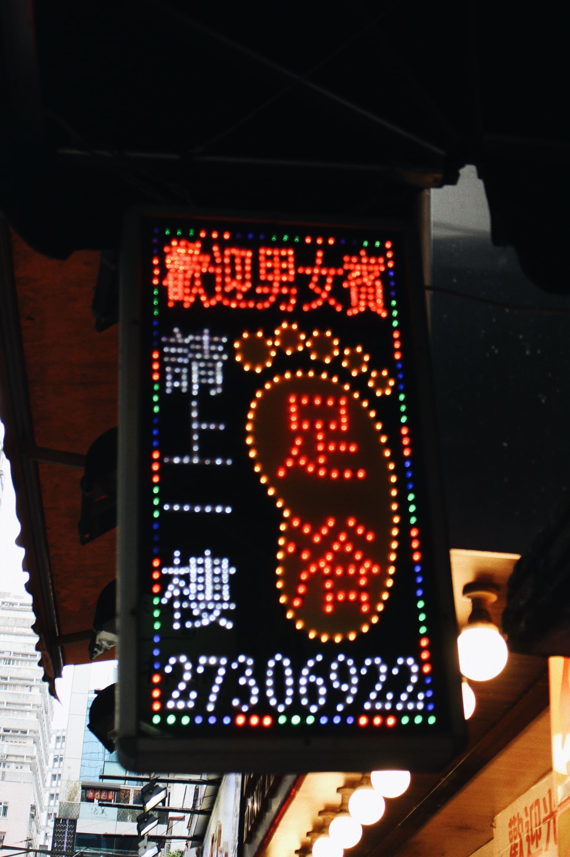
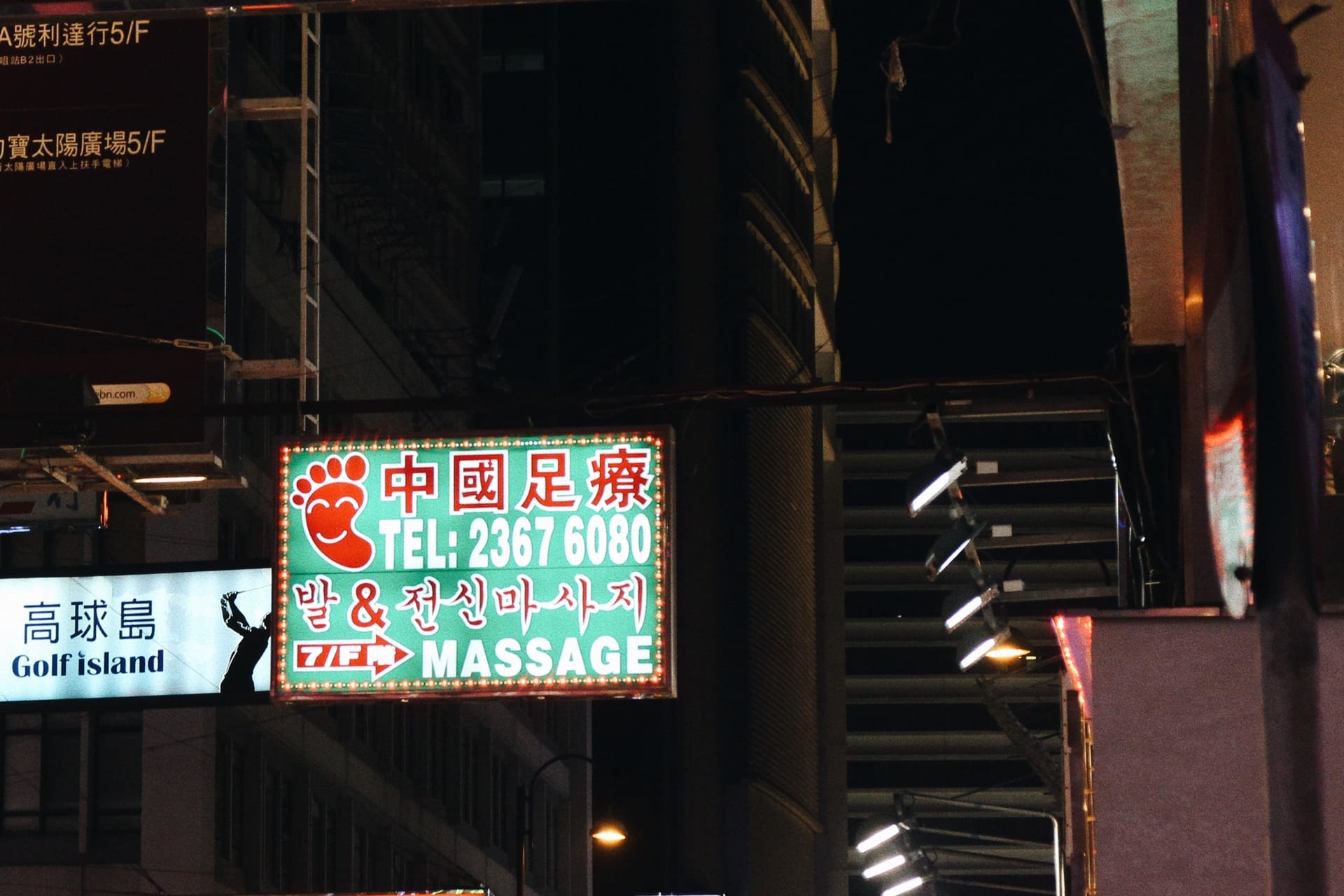
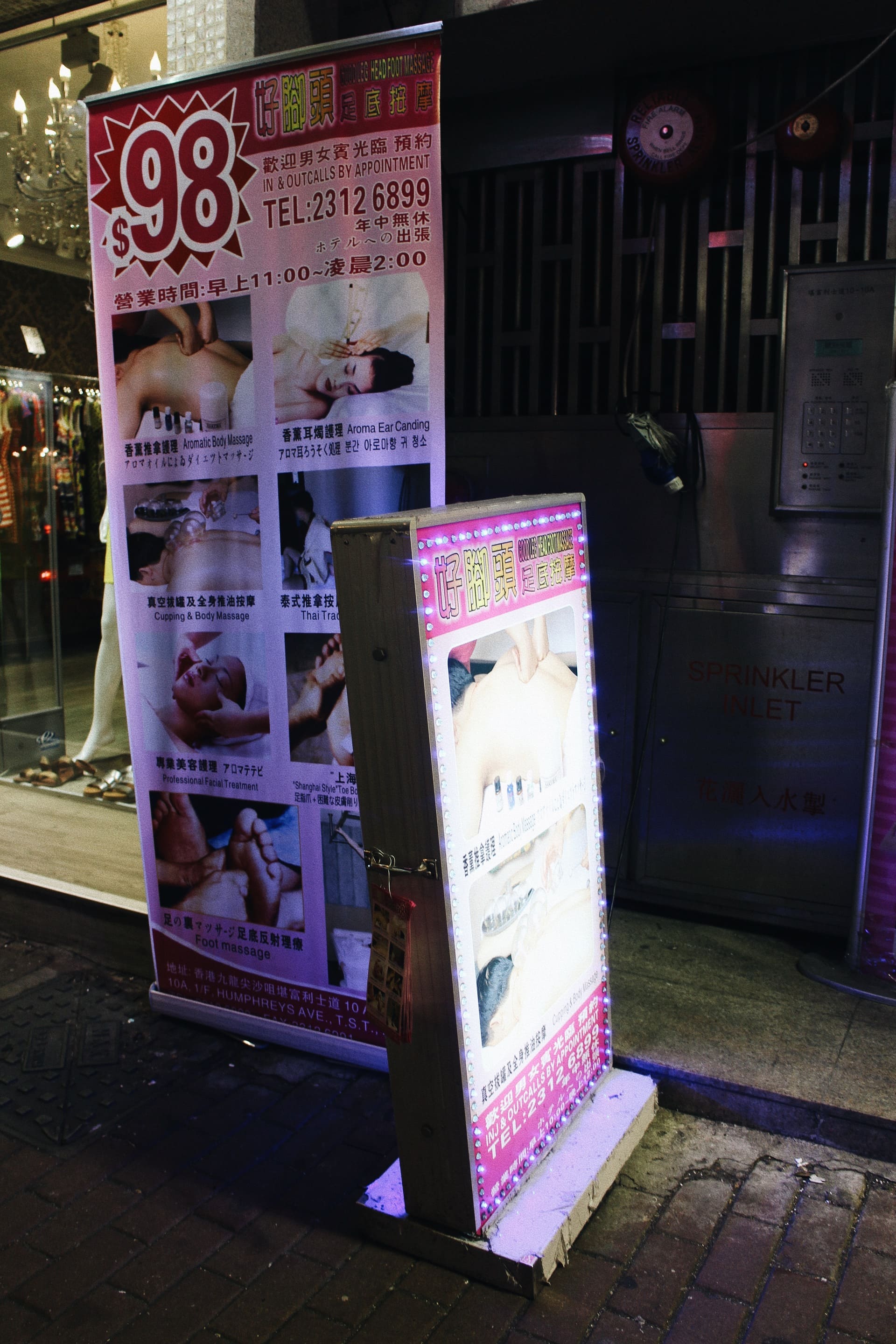
Different shop signs for massage parlours, from lightboxes to roll-up banners
Evoking authenticity
Shop signs are here to promote business, so it needs to be persuasive enough to make potential customers visit one shop instead of another. Authenticity is a useful way to attract people in terms of delivering trust and sparking curiosity. This section examines how businesses use traditional and foreign images and words to achieve their objectives. It also shows how this relates to Hong Kong's rich cultural exchange and integration since colonial times. This mix shapes Hong Kong's cultural identity and its unique aesthetic.
Sheer directness
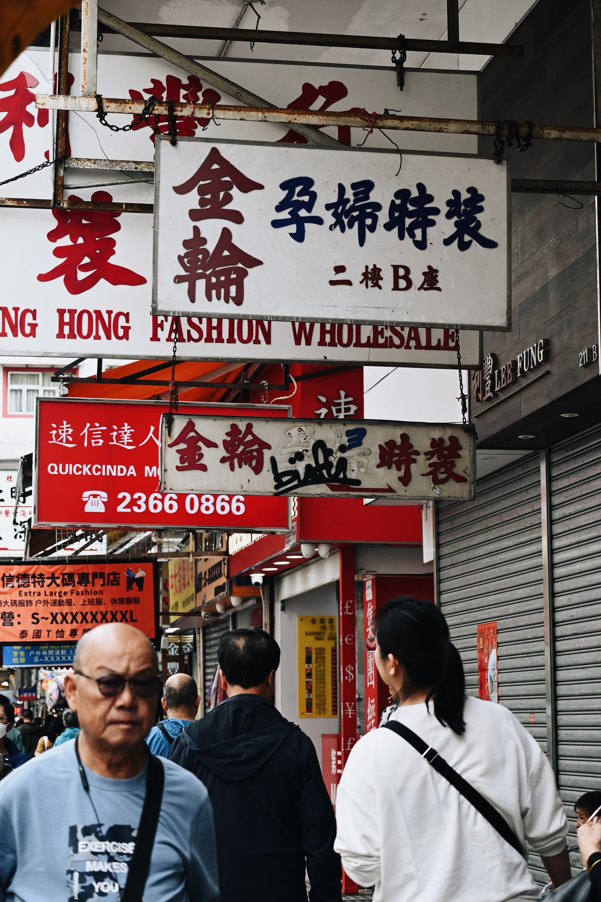
When it comes to delivering traditional ambience of local business, direct use of Chinese calligraphy (typefaces or custom writing), historic paintings, and ancient symbols is found in shop signs. The tradition of calligraphic shop signs has a long history before the rise of digital typefaces. Different styles e.g. Beiwei Kaishu and Lishu are used in different ways based on the atmosphere a business wants to create. For example, a Chinese clinic might use strong calligraphy for its signs to look trustworthy. In contrast, a bakery might pick a more casual calligraphy style to seem friendly. Lettering is also used in small businesses to display it to pedestrians.
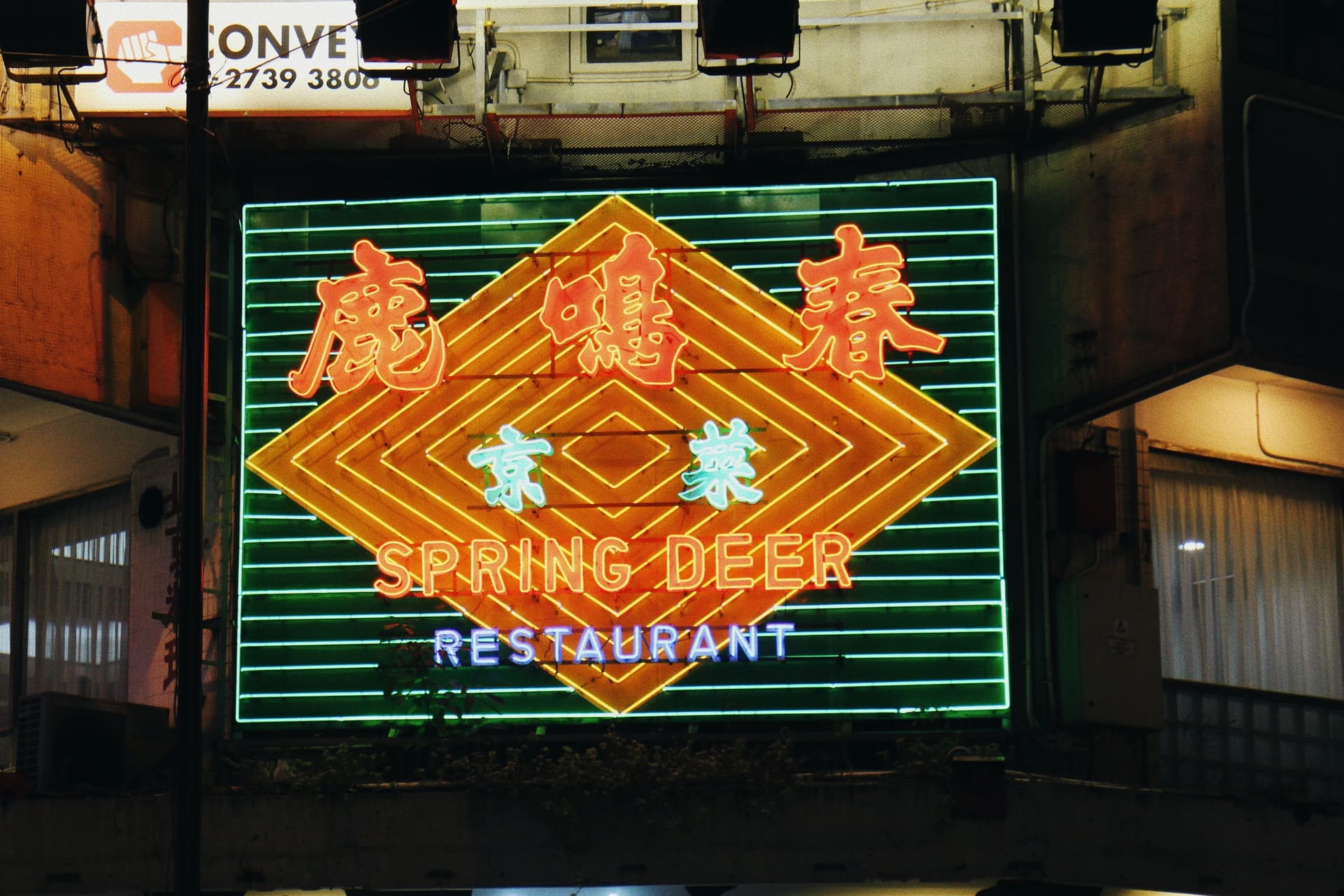
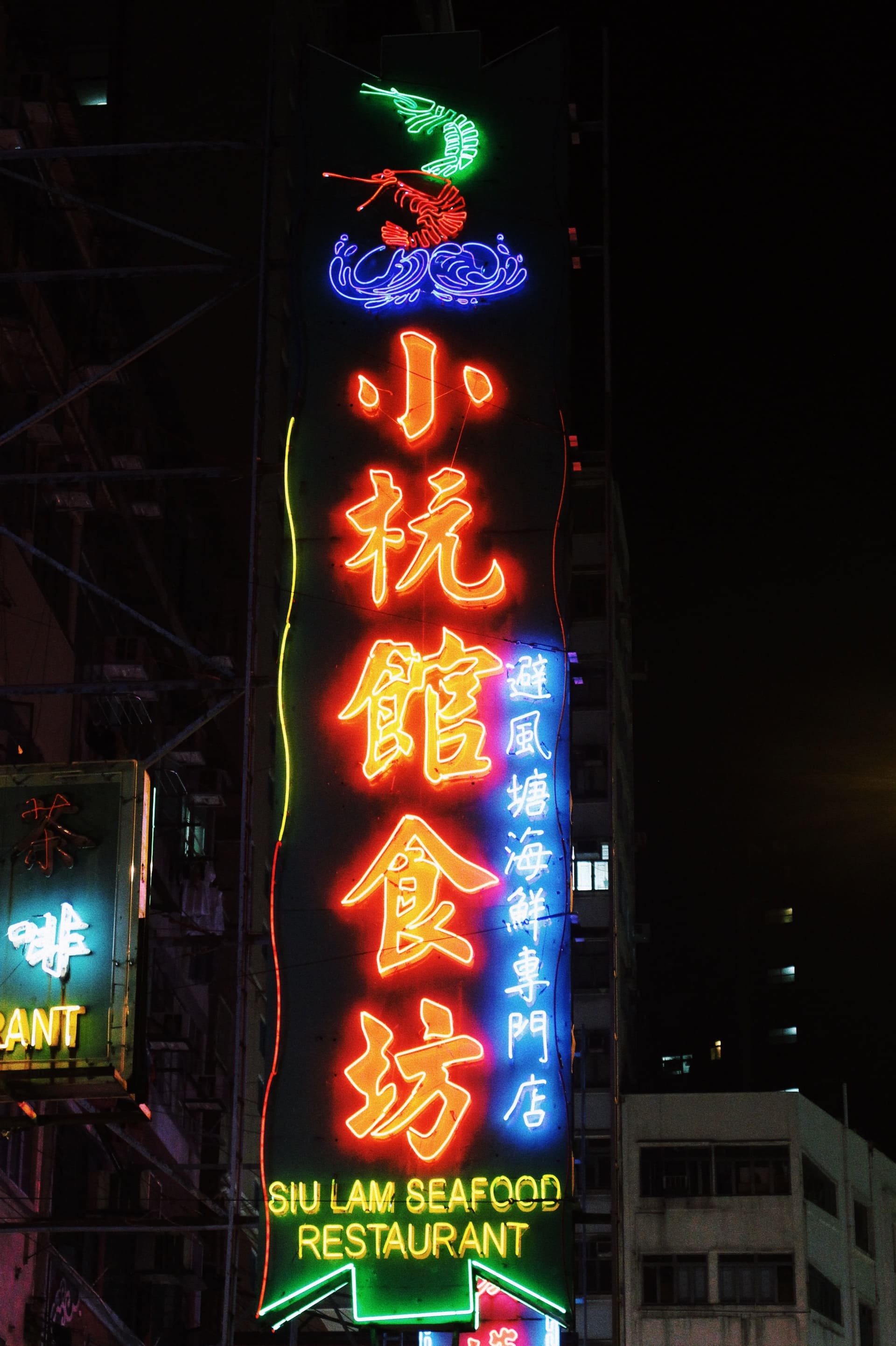
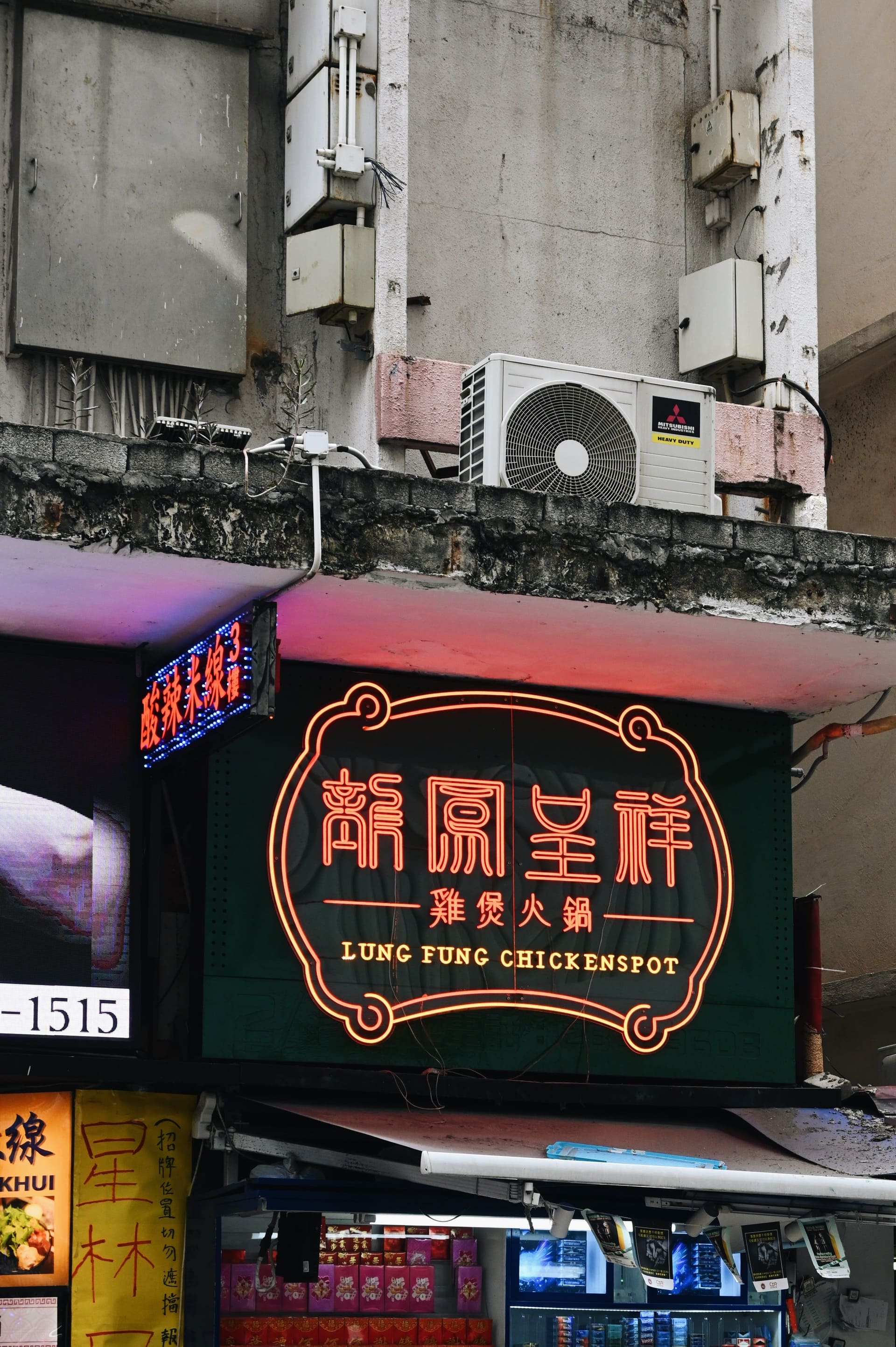
Different typefaces / calligraphic styles of shop signs of local business, fig.1 pawn shops, fig.2 unknown, fig.3 chinese herbal tea shop, fig.4 – 6 chinese restaurants
Businesses that want to create a sense of foreigness often use similar strategies. They choose historical images, pictures of people in traditional clothing, flags, and place names to stand out from their competitors. They also include foreign words and scripts as graphics instead of focusing on language. These signs serve as quick references to foreign cultures, easily seen on the streets. However, this approach can also strengthen stereotypes. It relies on common ideas or images that people usually have when thinking about a specific place.
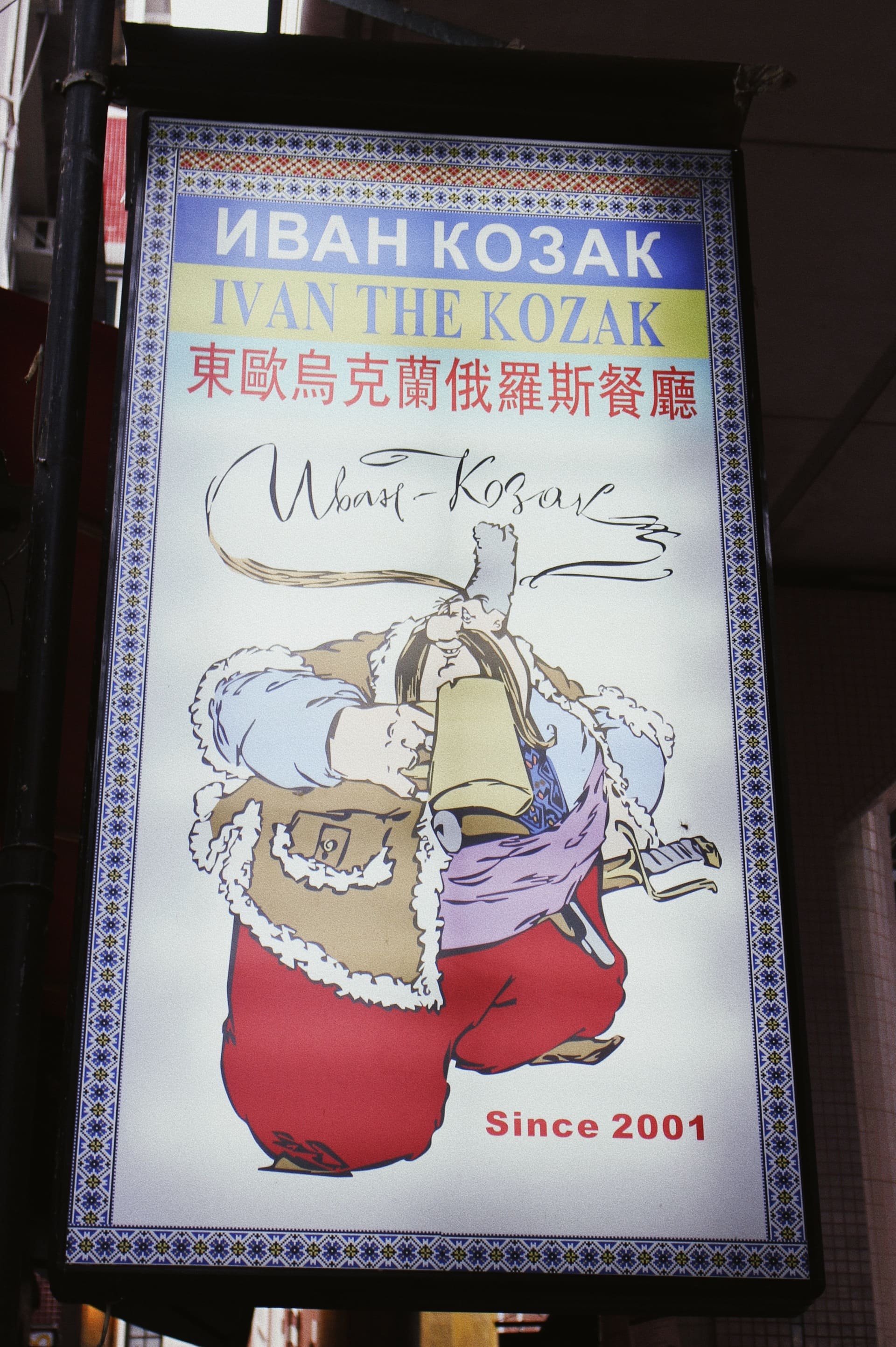
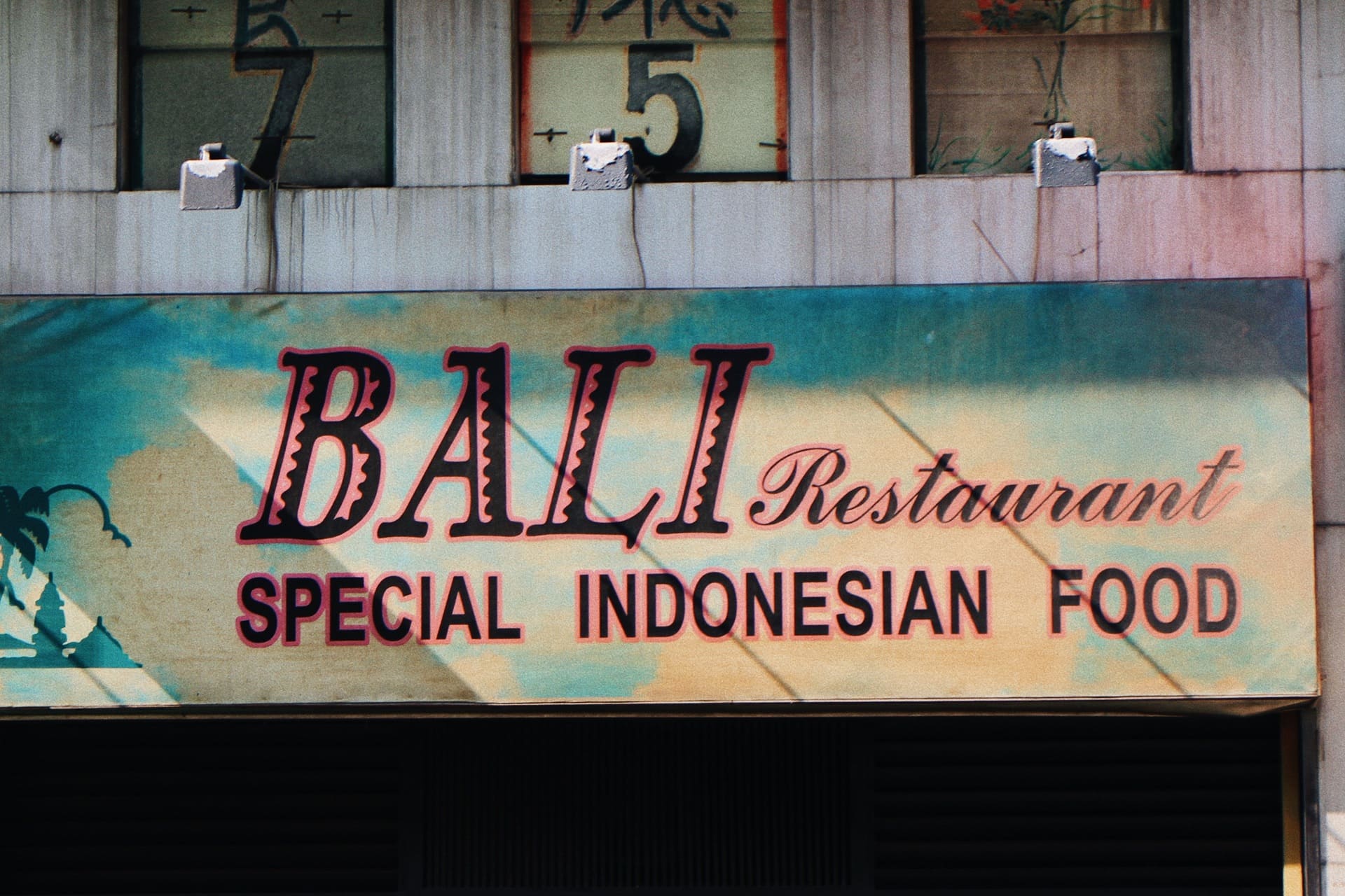
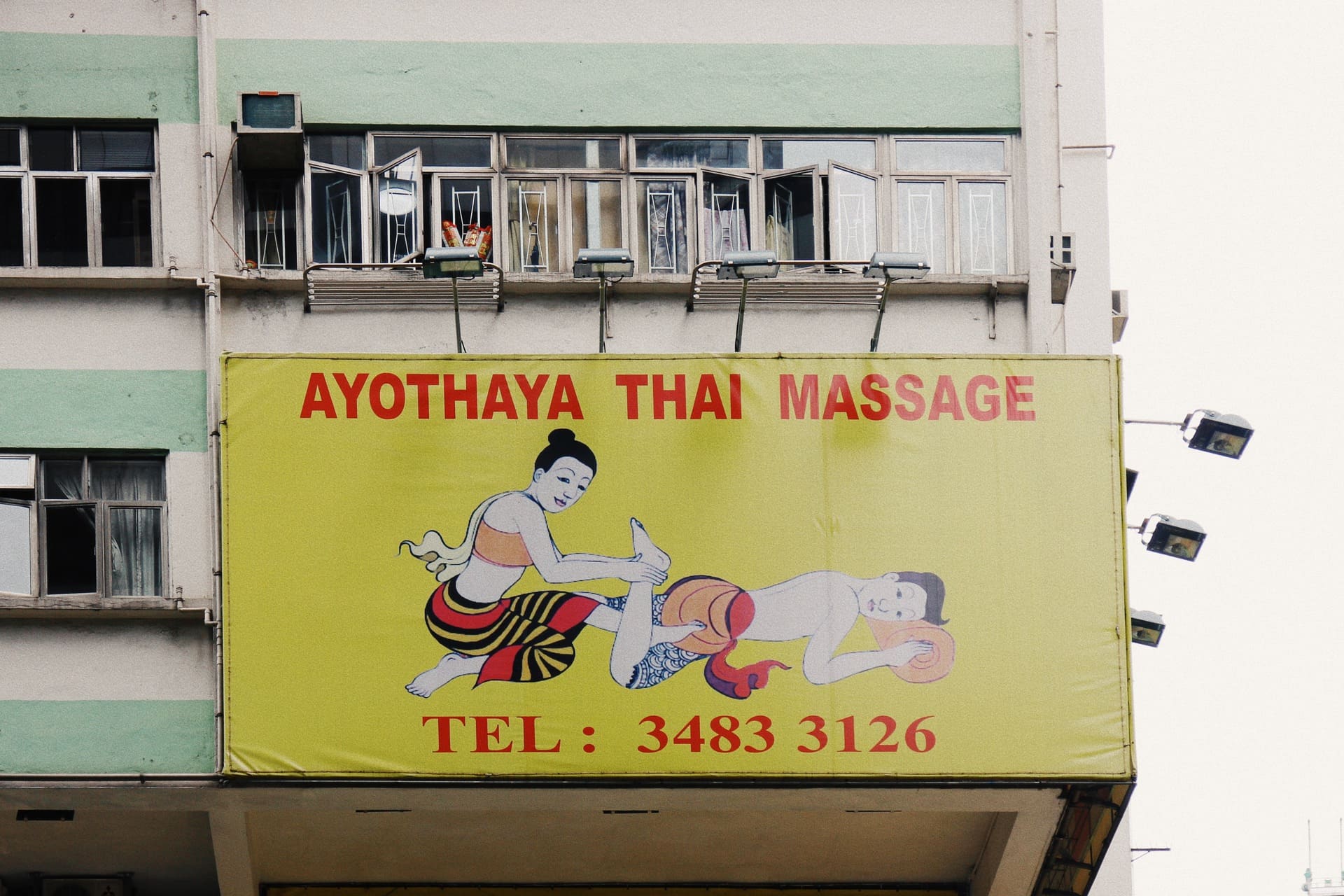

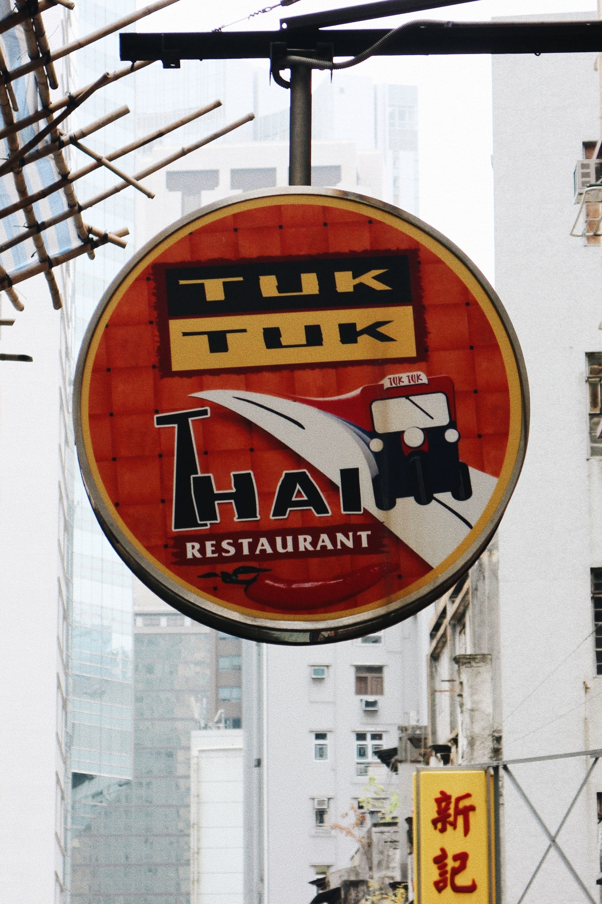
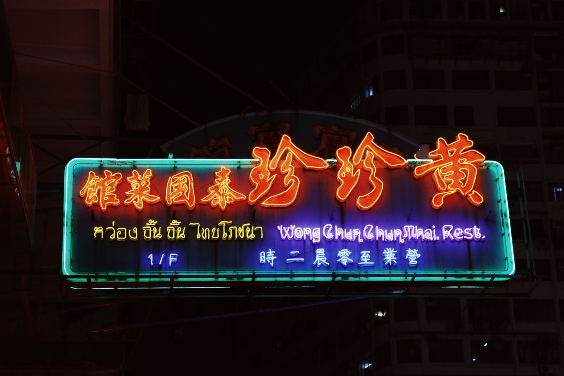
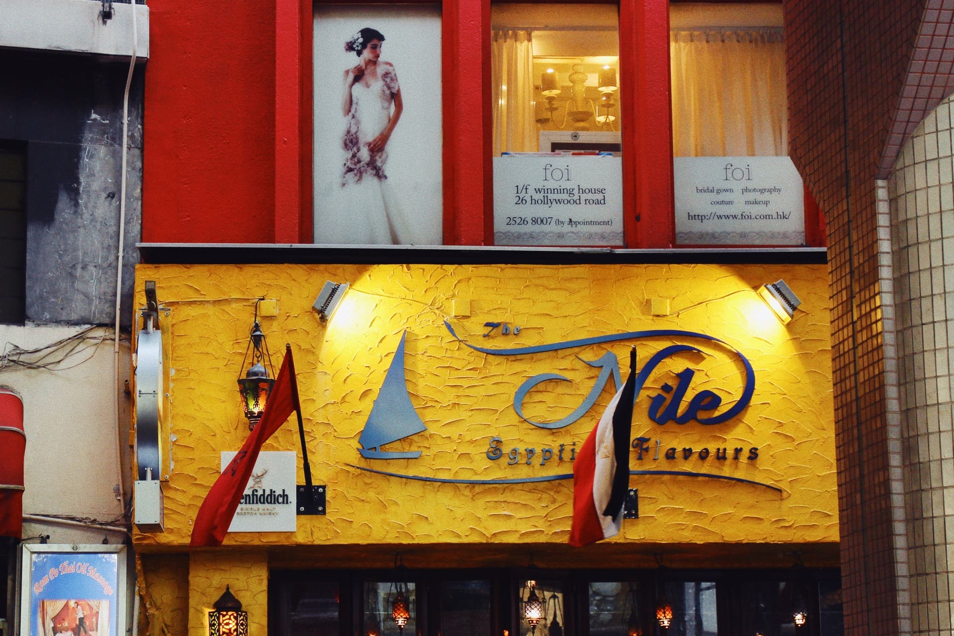
Different shop signs adopting foreign visual and verbal elements, fig.1 eastern European restaurant, fig.2 Indonesian restaurant, fig.3 Thai massage parlour, fig.4 Japanese restaurant, fig.5–6 Thai restaurant, fig.7 Egyptian restaurant
Misuse and separation of cultural symbols and origins
Sometimes accidents just happen, e.g. the shop signs have the glyphs and names different from the cultural origin of the business. The ‘mismatch’ shows an important aspect of vernacular shop signs, that gut feeling creates interesting encounters. Only symbols and names will be taken, leaving origins behind. Business owners often choose visual styles, fonts, and phrases that seem 'exotic' or 'cool.' They may not worry about whether these choices truly connect to their business. Instead, they focus on what looks appealing to their customers.

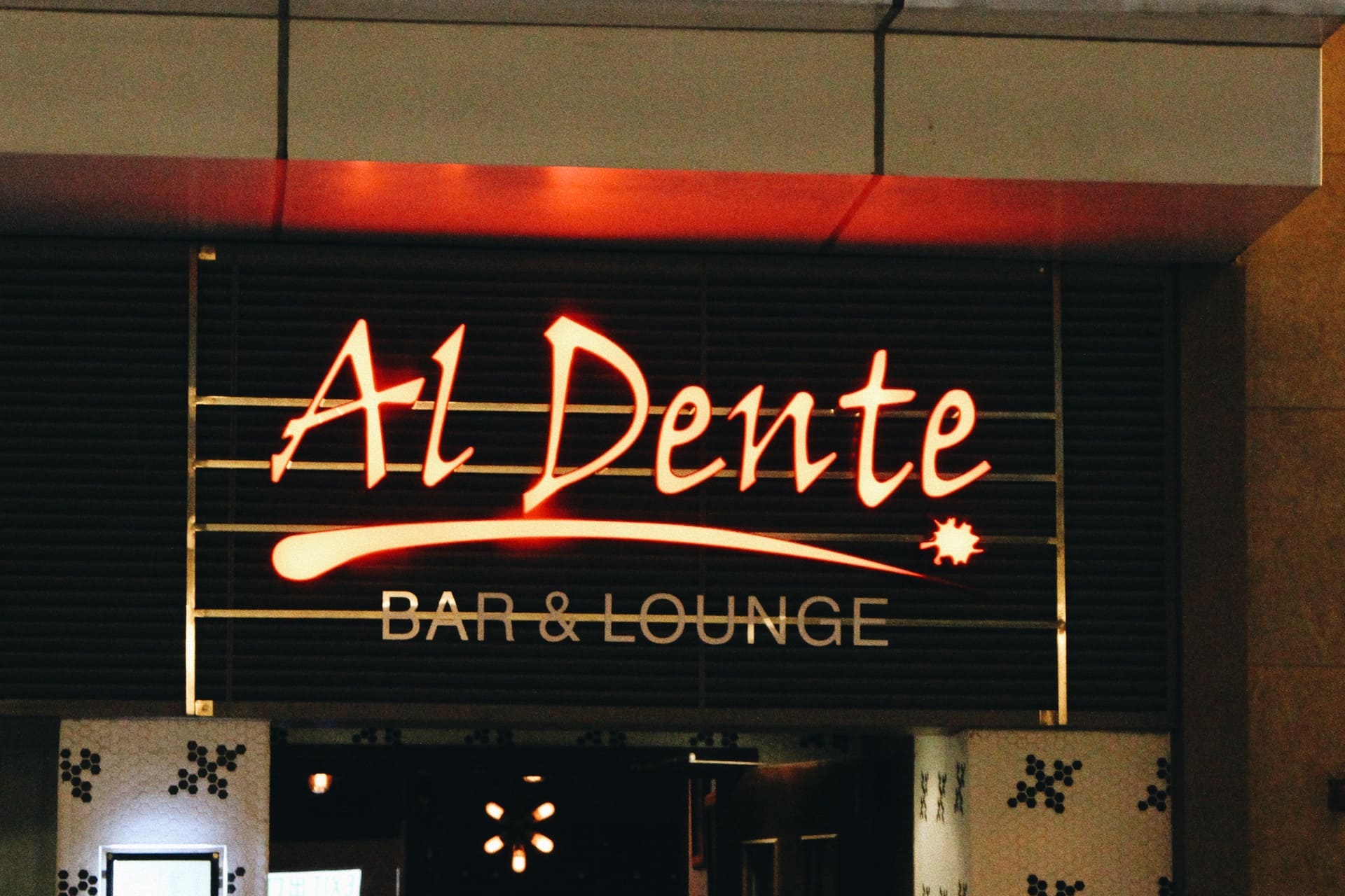
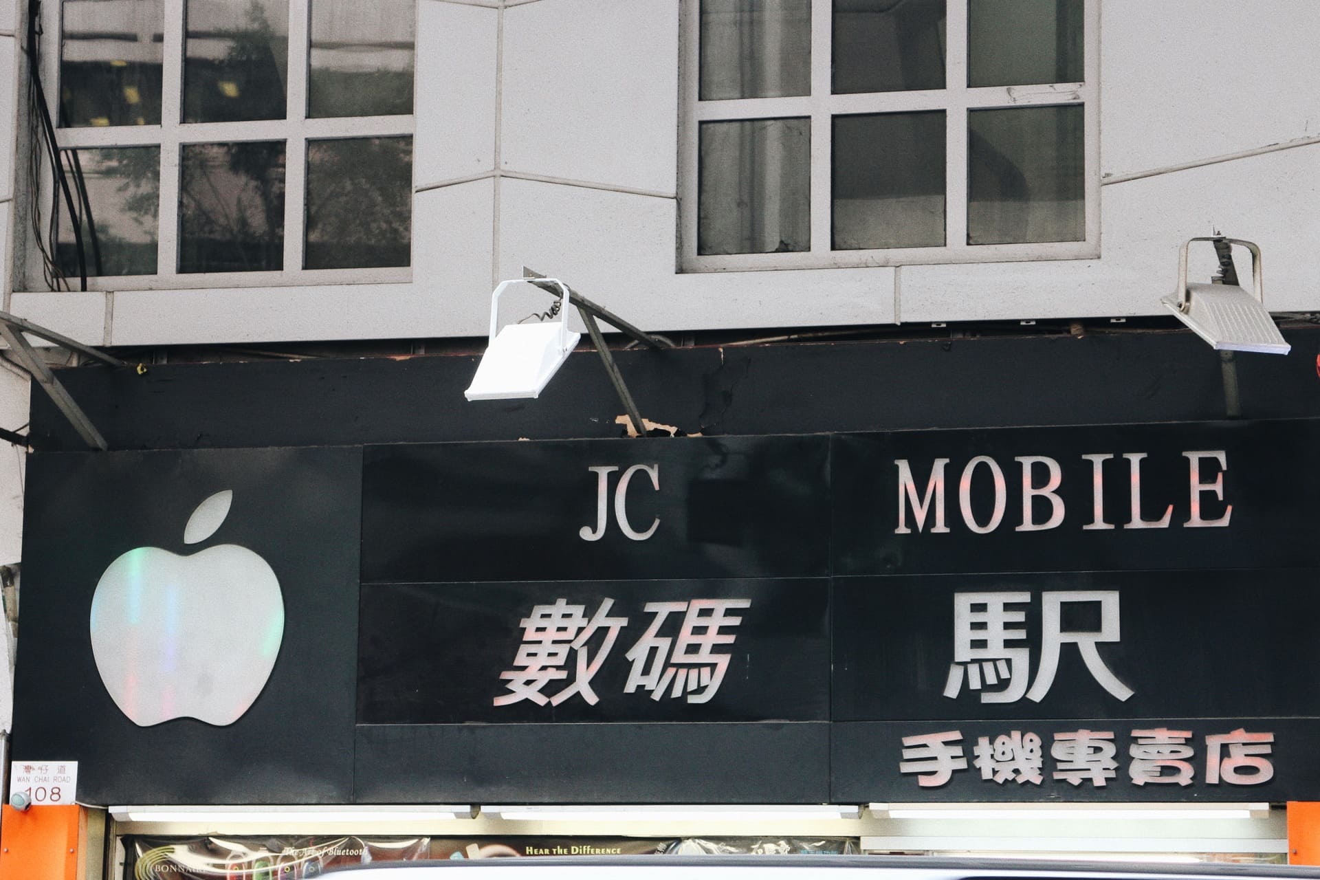
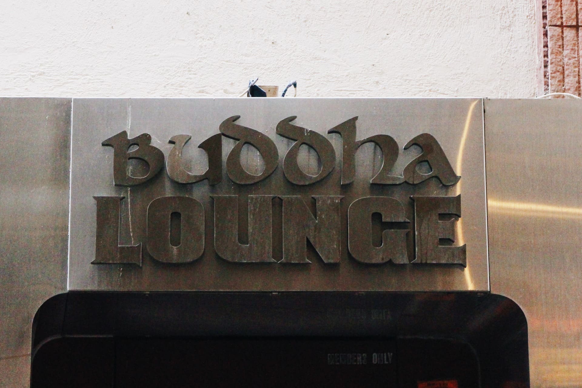
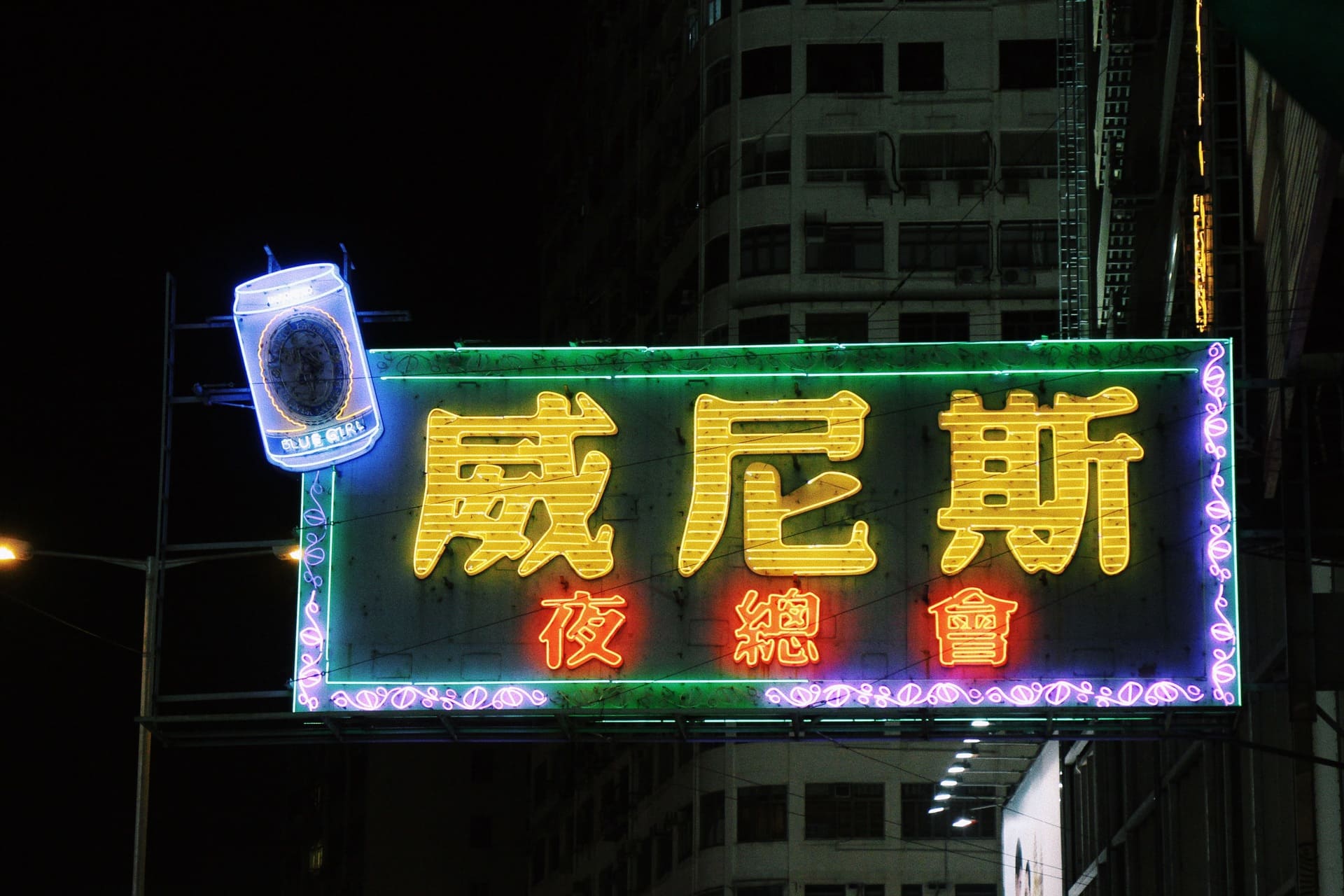
Examples of misuse and separation of cultural symbols and origins , fig.1 an Italian restaurant shop sign adopting blackletter, fig.2 an western restaurant using Italian phrases as shop name, fig. 3 a mobile gadget shop using Japanese character in shop sign, fig.4 a lounge using Buddha as the name and Celtic typeface, in which alcohol is forbidden in buddhist teaching and the typeface has nothing to do with the business, fig.5 the name of the nightclub is ‘Venice’, which has nothing to do with the business
Know the places – the relationship between shop signs and architecture
Business owners use all the space in their buildings to put up signs and promote their businesses. In the middle of the chaos, the shop signs can be split into two types. Some are fixed to buildings and store fronts, while others are movable. Digital screens are now used to share information and promote businesses, thanks to advanced technology and wide use.
A typology of shop signs
Signs with lower mobility
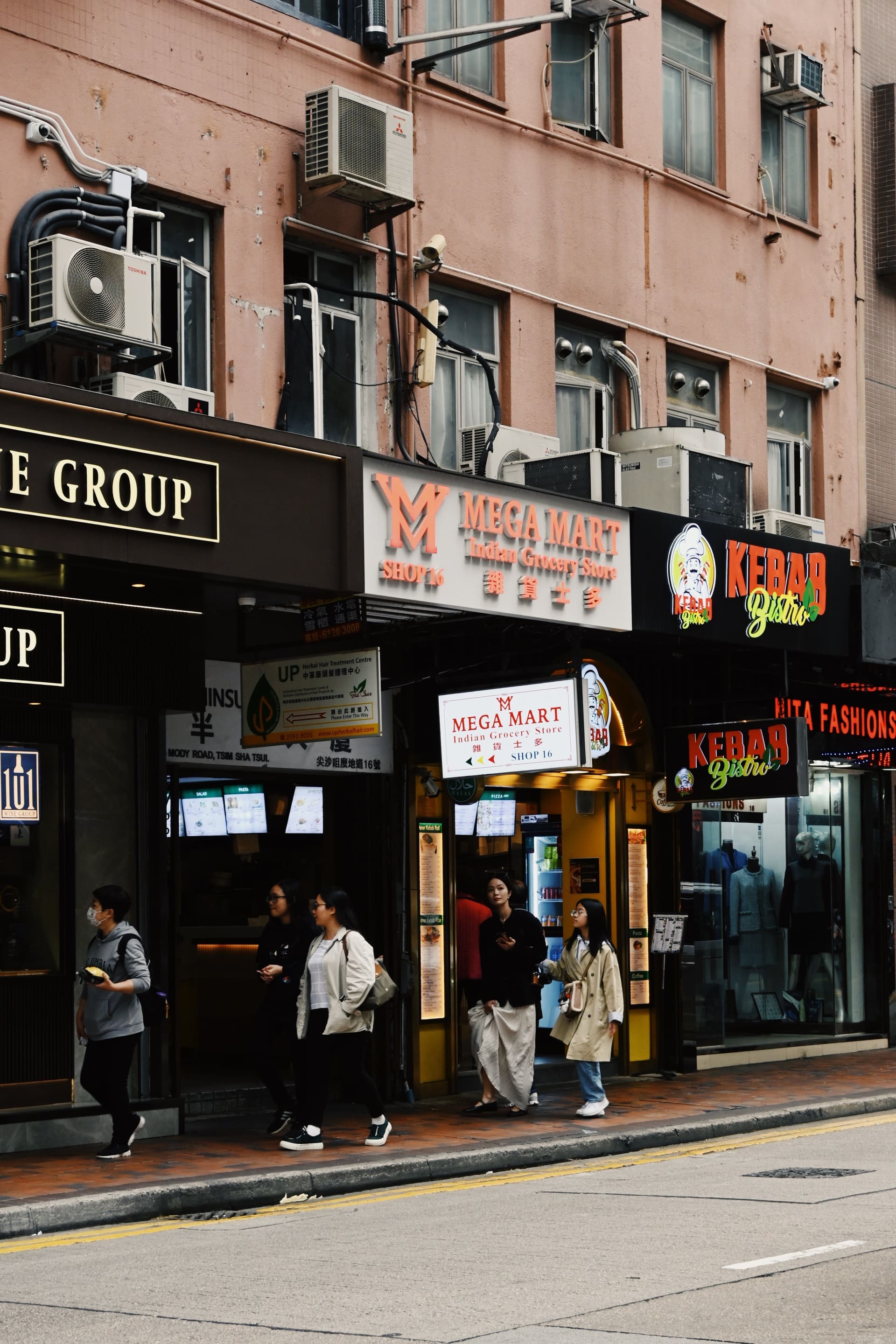
The shop signs can be adhered as extension of the buildings, (on the top of the building, projecting columnar, projecting irregular, and projecting banner), and be placed on the buildings (façade coverage (including billboard on building surface), building corner fascia, building fascia, building columnar, and digital advertising screen. These are viewed from far away. The ones on shopfronts (shopfront columnar, shopfront projecting, shopfront fascia, shop window, plaque inside shop) are to be viewed closely.
Signs with higher mobility
These include lightboxes for advertising, shop signs in glass windows, roll-up banners, awnings, billboards or signs on the ground, and signs behind glass walls.
Defining spaces
Shop signs shape the look of buildings and help people find their way in a city. They create a sense of place and make streets inviting for exploring. However, gentrification and urban renewal have changed how these signs are designed and how they affect navigation.
From delightful chaos to sterile order
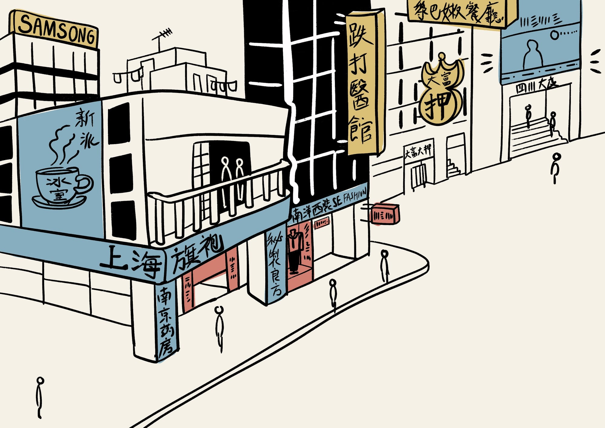
Urban development, renewal, and gentrification change how shop signs are arranged. This includes their layers, size, and how they connect with buildings around them. In the past, numerous signs of different sizes were placed, as a part of buildings/shops and extensions of buildings. They form layers and layers of signage. For example, in the case of tong lau (tenement buildings built from the late 19th century to the 1960s in Hong Kong ), with lower floors as shops and upper floors as flats, the shops utilize the shopfront and hang signage on the buildings to promote business. The similar-looking buildings from the post-war modernist era lead business owners to put up signs on the buildings. These signs and extensions help give the buildings a sense of identity and push back against modernism.

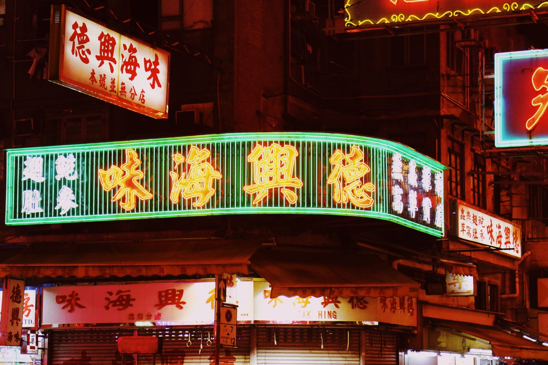
Layers of glowing shop signs at night
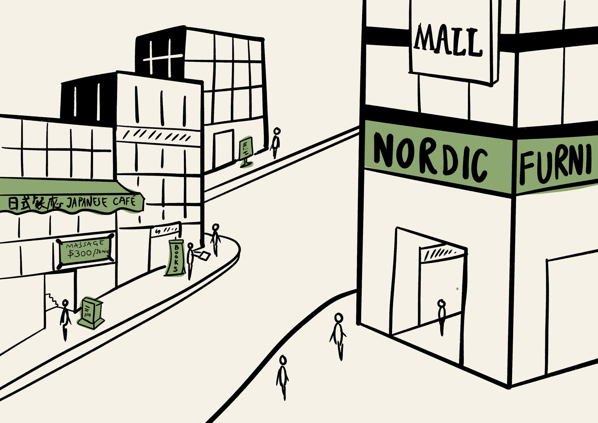
As cities grow and change, shop signs are becoming smaller. While they can still be part of buildings and stores, their size and scale have been reduced. They are more likely to be found as shopfront projecting signs or fascia instead of extension of buildings; if they are found as building extension, they are likely to be adhered in an orderly manner instead of spontaneous layers.
Shop signs displayed in a orderly manner, with the fixed frames adhered to the buildings
Also, the empty space near the buildings helps people find their way by showing where a building is located. It is found in hotels and new shopping malls, which owns a reasonably big area, whether for entrance, driving area or simply rest / open space. When having the obvious emptiness in an area full of buildings and narrow pavements, it informs pedestrians of its presence.
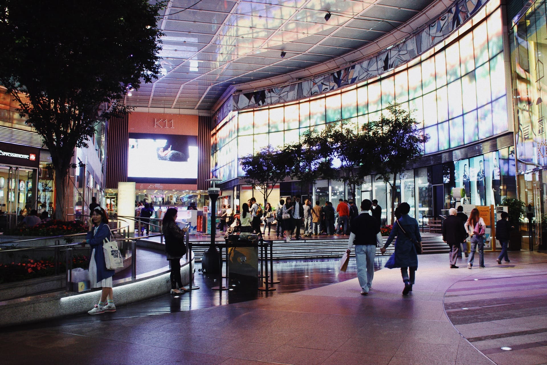
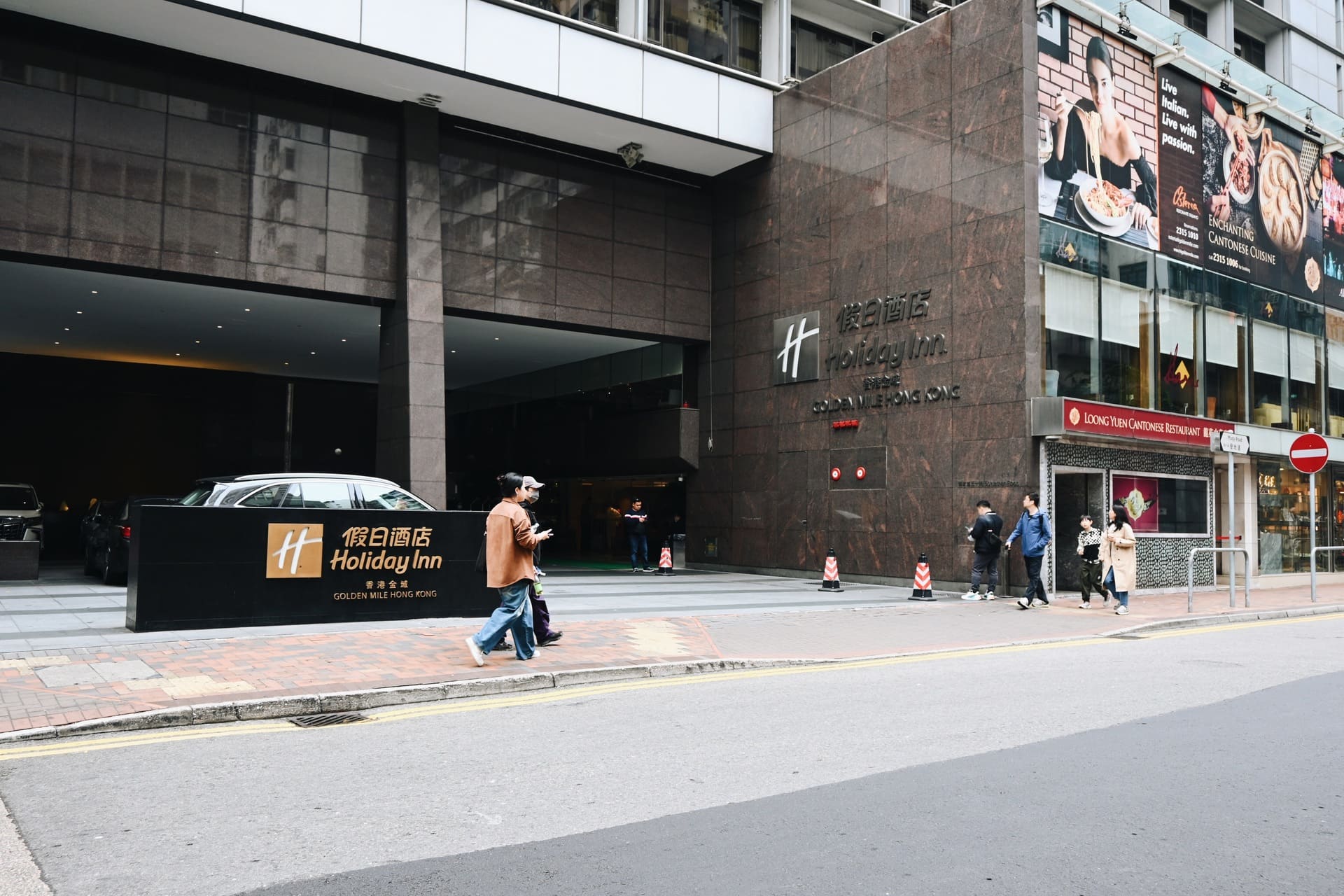
fig.1 open spaces of a shopping mall, fig. 2 parking space and entrance of a hotel
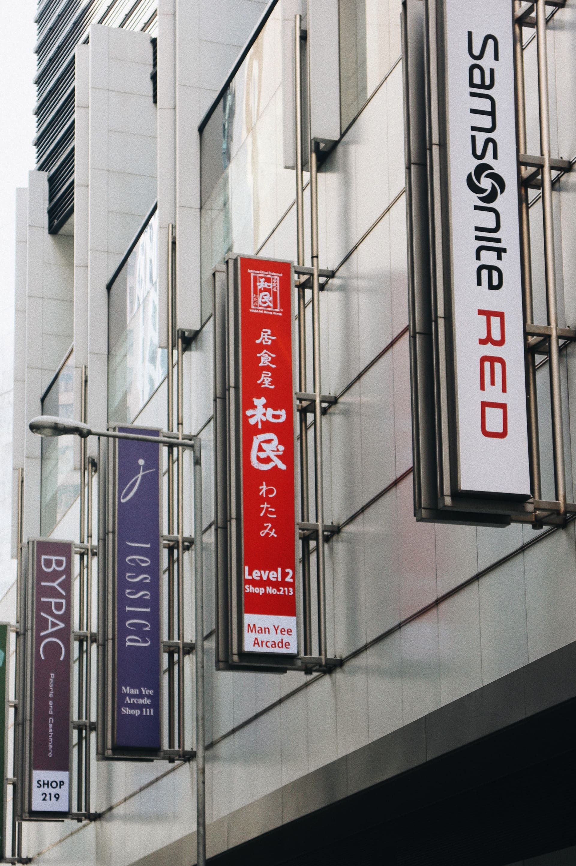
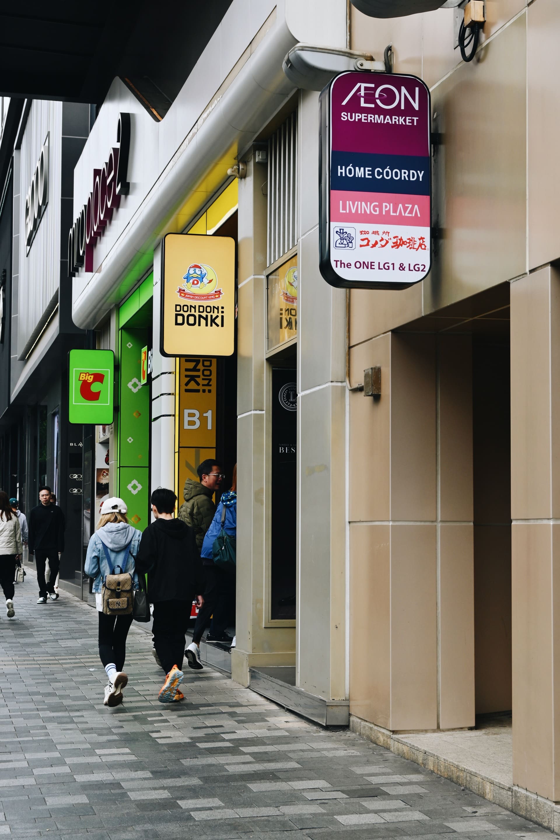
Also, with gentrification and urban renewal, shop signs tend to be placed indoors / inwards of the architecture instead of being adhered outside it. In gentrification, landmark architecture is built and glass is used extensively, forming large glass windows or walls of the architecture. This enables people to see inside of the buildings. Large advertising banners are used inside the buildings to make the most of the space.These banners can share information about the business without needing to put up signs on the outside walls. This creates flexibility of the signage, that the content can be changed whenever shops change.
Some shops place signs of different shapes or advertising canvas behind the glass walls, and the landmark architecture amplified the visual impact. Landmark buildings help people find their way because they are easy to see from a distance. Being huge glass boxes of different shapes and displaying different kinds of business, they challenge the conventional placement and forms of shop signs.
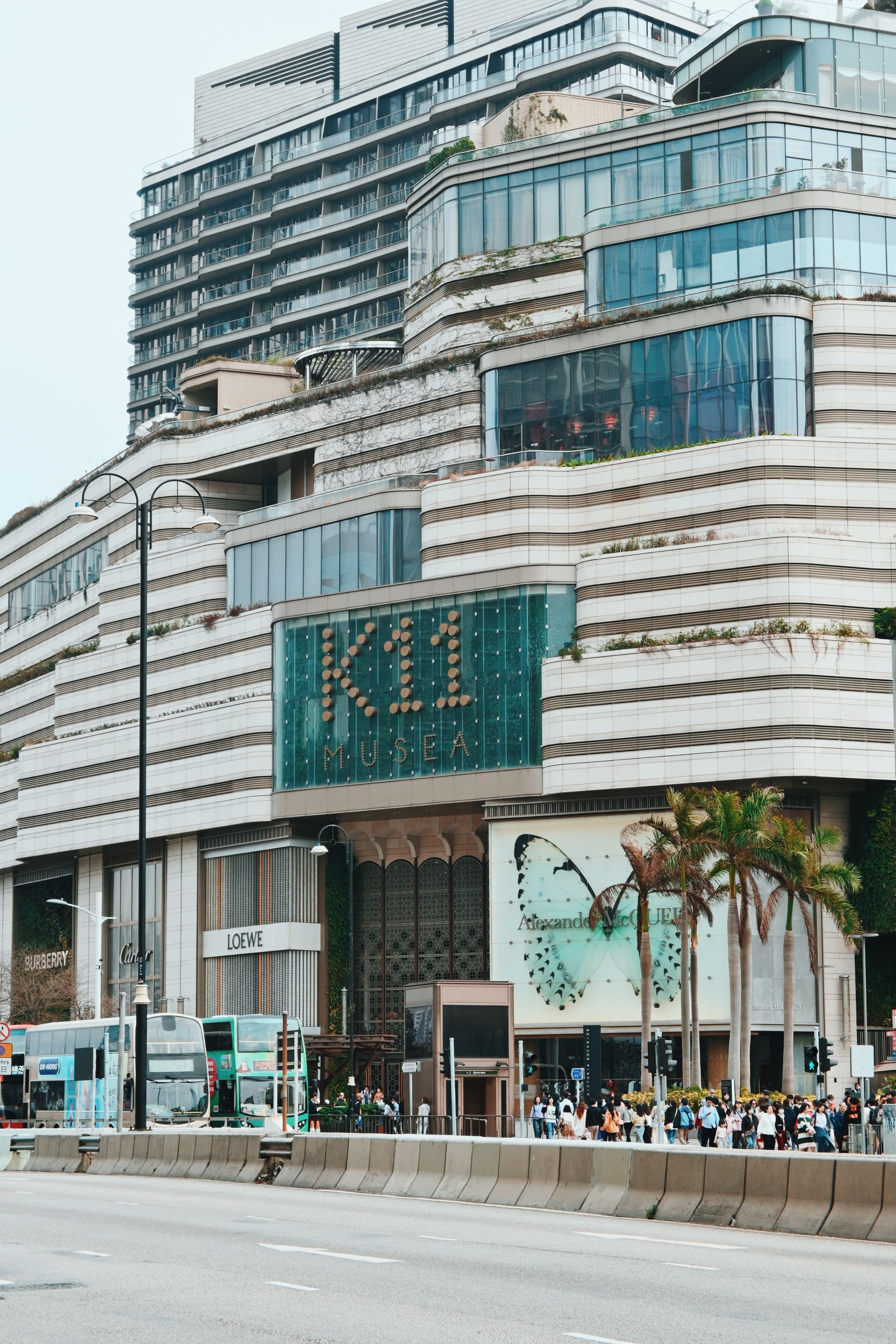
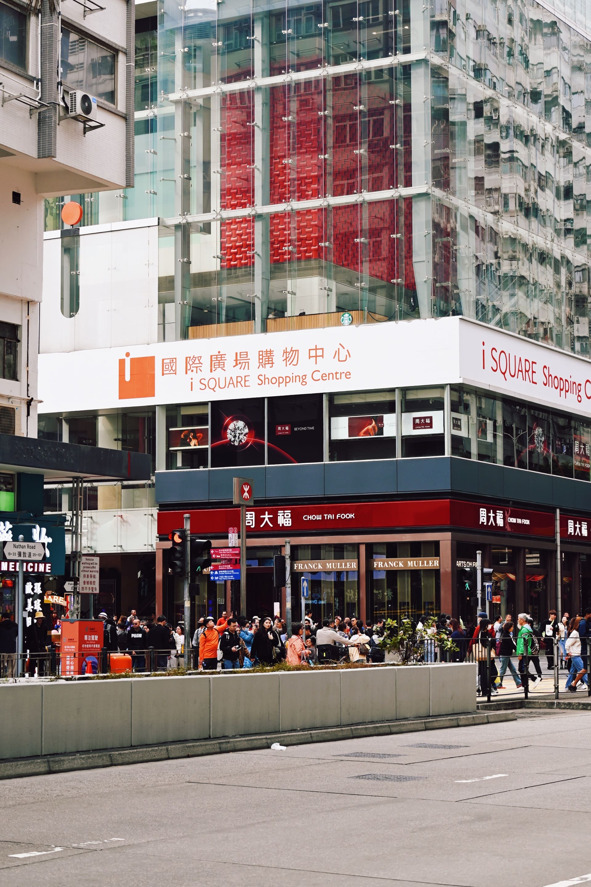
Gentrified shopping malls with their logo on the buildings
As for commercial skyscrapers, they usually have their names at the entrance. The top of the building is used for the building's name or large neon signs. These signs often belong to global companies, making them visible from a distance.

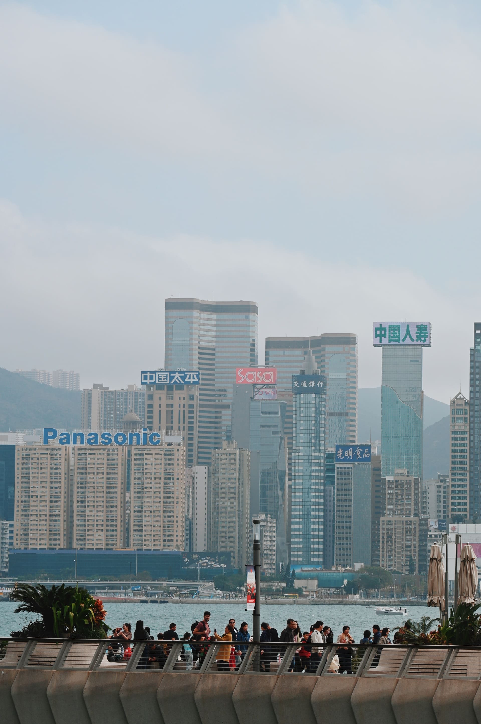
Signs of global corporations displayed on the top of the skyscrapers, which can be viewed from far away, even across the harbour
Role of shop signs in wayfinding
Shop signs help people find their way by showing directions and naming the businesses. They inform visitors about what to expect and what shops are nearby. This makes it easier to search for places and adds to the atmosphere of the street. With clear signs, streets feel more inviting for exploring and wandering. When without shop signs, ways of walking become more searching-oriented. People need to deliberately find the place and more rely on maps (whether digital and paper), the wayfinding process will be more detail-oriented. The presence of signage changes the way of walking.
Shopfront projecting signs informing people of the upcoming shops in the street
The importance of traditional shop signs is lessening when it comes to guiding people and creating a feeling of location. However, shop signs offer qualities that landmark buildings often do not. They can easily change their content and design, and they can quickly evoke emotions. Shop signs have a chance to create atmosphere by using their ability to move and their lasting messages effectively. Moreover, they are important items that show vernacular culture and social-economic growth. The cityscape of Hong Kong is changing quickly, but we hope the spirit of cultural exchange and integration still thrives.
(Originally named as 'The scene of the signs – a close look at Hong Kong shop signs as socio-cultural representations' and published in early 2024, this article has been updated for readability.)